Goals
01
Analysis
02
Planning


03
Information Architecture
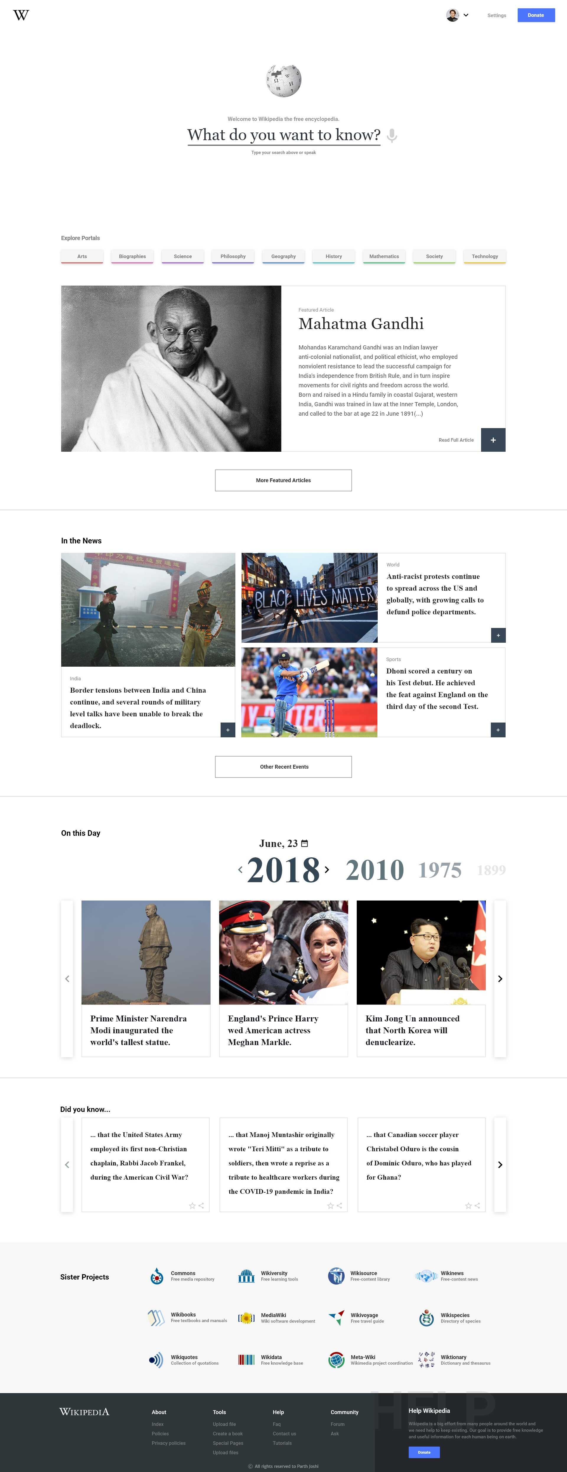
Home
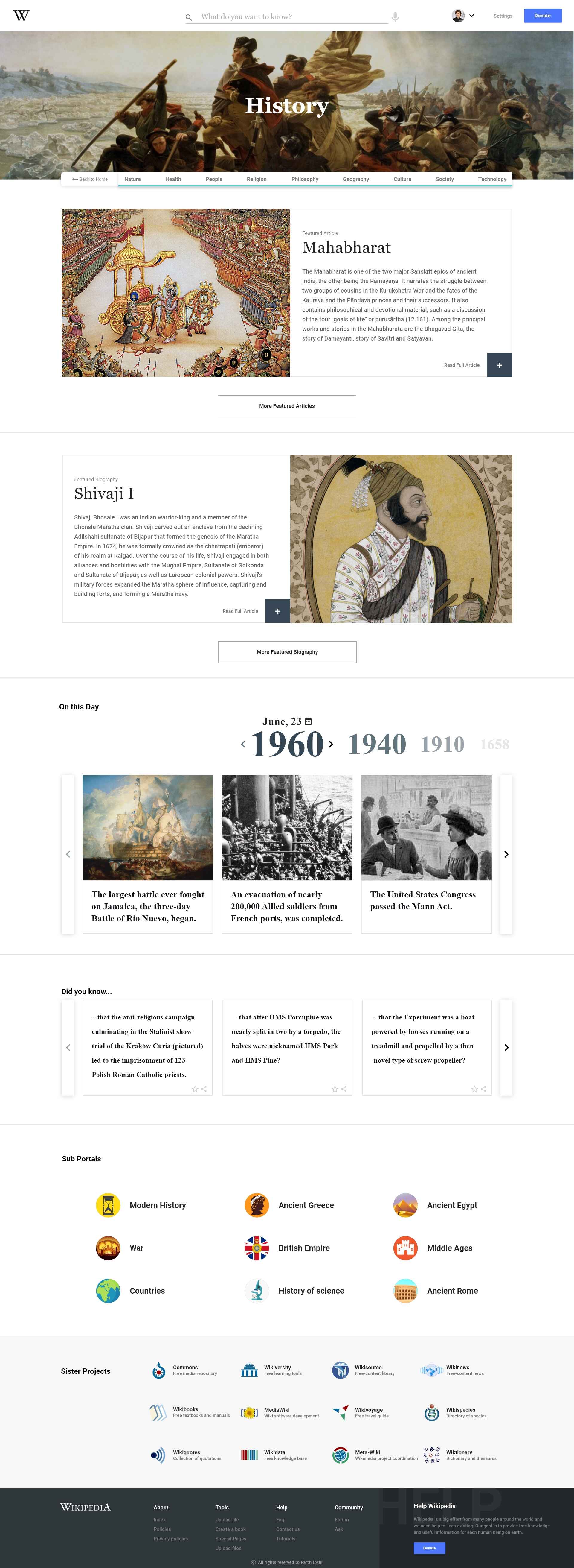
Portal Home
Article